Turquoise represents a blend of calmness from blue and rejuvenation from green, commonly symbolizing protection, wisdom, and tranquility across cultures. Its meaning varies from spiritual healing in Native American traditions to prosperity in ancient Persian societies, with modern associations leaning toward balance and sophistication, as evidenced by historical mineral patterns and spectral analysis.
Staring at a turquoise jewelry case or web design palette, you might assume it's merely a "happy blue" representing oceans everywhere. But you'd be overlooking centuries of cultural nuance—like why Tibetan monks consider it protective armor or Persian architects saw it as paradise fragments. When we treat turquoise as a monolith, we strip its layered geology and symbolism. This article dismantles six persistent myths using chromatic science and global anthropology, revealing why your turquoise rug might whisper calmness while your ring shouts ancestral strength. By the end, you'll confidently distinguish Mesoamerican green-turquoise from Egyptian blue-turquoise using observable cues, helping you make thoughtful choices in anything from UX design to cultural artifacts.
Myth: Turquoise is universally a beachy blue
Myth: Its calmness works equally in all contexts
Myth: Traditional patterns are purely decorative
Myth: Natural stones always look jewel-toned
Myth: Color science defines its cultural power
Myth: Authentic turquoise requires zero verification
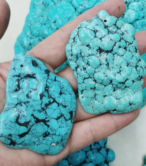
Many assume turquoise sits comfortably within the blue spectrum—you know, that bright tropical wave on travel brochures. This oversimplification might stem from digital interfaces where #40E0D0 gets casually labeled "just another blue." But consider this: if turquoise were merely blue, why would Pantone standards explicitly mandate 5G–10G green components? The truth is, turquoise straddles worlds between wavelengths 485–500 nm. Copper-rich minerals from Arizona deserts shift toward blue-dominant tones, while iron-influenced deposits lean into malachite greens. Calling it a "blue subtype" ignores centuries where artisans valued precisely that green-blue tension—societies like the Navajo even prioritized matrix patterns where veins signaled authenticity.
Turquoise occupies a specific territory governed by physics, not poetic license. Spectral charts position it firmly at HSV 174°, 100%, 88% saturation—mathematically equidistant from pure green and blue. Geological surveys reveal why: deposits in arid regions form differently than synthetic variants. Untreated stones from Nevada's dry mines show soft porosity, absorbing water faster than lab-created counterparts. But here's the nuance: azure-dominated turquoise can skew clinical without green's warmth, while heavy green blends risk losing blue's professional crispness. That copper-blue synergy? It's nature's balancing act.
Pop culture often reduces turquoise to marine themes—your turquoise swimwear or beach towels get marketed as "ocean energy." While coastal associations exist, this ignores why Aztec ritual knives featured intricate turquoise mosaics or Persians tiled domes with it as pathways to divine unity. Uniform symbolism fails because Tibetan Buddhism embeds turquoise into spiritual armor, Egyptian mythology ties it to resurrection, and Navajo healing ceremonies require spiral motifs. In contexts like digital interfaces, turquoise might project tranquility, but Persian miniatures used it precisely because the color resisted single interpretations—it held earthly and heavenly dualities.
Historical texts confirm turquoise's role shifts based on surrounding elements and cultural codes. Standalone turquoise walls in corporate offices might evoke sterile detachment when paired with metallics, whereas temple murals framing turquoise goddesses suggest protection. Excavations at Olmec sites prove this adaptability: royalty reserved turquoise for objects signaling sacred power, while European artists historically struggled to replicate it due to mineral scarcity. For designers today, that means avoiding universal "calm blue" defaults. Your Persian-patterned vase deserves different turquoise saturation than your meditation app UI. The takeaway? Cultural motifs determine meaning.
When interpreting artifacts or designs, these observable cues help decode context:
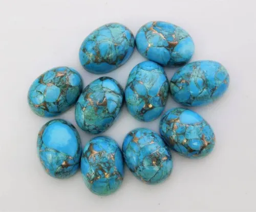
Jewelry ads show turquoise as consistently saturated, and you might expect a pure, unbroken cyan in every mineral. Reality proves messier: malachite blends push turquoise toward mossy shades, while aging oxidizes stones into murky blue-grays. Why? Geological instability. Turquoise forms from porous copper deposits where environmental fluctuations cause uneven color distribution—New Mexican specimens exhibit darker matrix patterns due to sediment layers. Synthetic versions bypass this unpredictability but lose authentic weathering signatures. Even Pantone acknowledges a spectrum requiring 5G–10G green ratios alongside blue dominance.
Light conditions further alter appearances. Synthetic dyes reveal themselves easily—display turquoise under tungsten bulbs versus daylight LEDs, watching for hue shifts. Iron-rich origins show higher green ratios under magnification, while stable blue hues indicate copper-rich sources. But beware: high translucence may suggest geological age, yet soft stones typically absorb water faster, risking damage. This material tradeoff explains why ancient artisans kept vibrant coloration through mineral stabilizers, erasing "natural" patinas. When evaluating stones or pigments, spectrophotometers can detect saturation gradients indicating treatments. Ultimately, turquoise's beauty lies in its variability, not lab consistency.
Most sources bill turquoise as innately calming—think spas using turquoise towels to induce relaxation. But color psychologists note your surroundings dramatically modulate its impact next to cool grays it can feel austere or detached. Consider corporate branding: blue-dominant turquoise may convey precision during presentations, yet hospitals avoid all-blue palettes fearing sterility. Studies tracking heart rates in turquoise rooms confirm nuance works best alongside warm neutrals like terracotta or ochre counterbalances potential coldness.
Turquoise's duality stems from physics: occupying blue's stability while inheriting green's liveliness. Persian architects exploited this, using turquoise glazes on domes to simultaneously ground temples while connecting them to celestial energy. Modern UX designers apply similar balancing—turquoise credibility indicators in apps (like verification checkmarks) harness high readability without overwhelming users. Key lesson? Placement matters. That Navajo blanket with turquoise accents beside warm reds encourages contemplation; isolating the hue risks disconnection. You might experience this when seeing turquoise-walled galleries with minimalist décor—awe quickly becomes discomfort without texture.
It's easy to pigeonhole turquoise in jewelry or bohemian décor, overlooking its digital utility and archaeological significance. But Aztec societies prioritized it for ceremonial objects like ritual knives—far from "decorative use." Similarly, modern UX research shows turquoise outperforms blues for readability in verification badges or "trust indicators." The high luminance cuts through visual clutter without straining eyes under blue-light conditions. However, cultural authenticity may constrain designers: traditional Navajo patterns often require natural matrix inclusions unsuitable for minimalist web elements.
Synthetic turquoise offers uniform appearance but sacrifices geological storytelling. Here’s the design tradeoff: natural stones convey cultural weight through matrix veining, yet treated specimens guarantee color stability. When designing interfaces, blue-dominant hues enhance professionalism, whereas green-leaning tones suit wellness content. Either way, always verify origins if cultural accuracy matters—modern Navajo artists retain specific mineral traits for symbolic authenticity.
Many assume turquoise holds identical prestige worldwide, ignoring gaps between Aztec empires and medieval Europe. Archaeology shows stark disparities: Mesoamerican royalty hoarded turquoise for spiritual mosaics, while Renaissance painters valued lapis lazuli more due to scarcity. Tibetan traditions still consider visible matrix patterns essential for protective qualities—a detail overlooked in mass-produced souvenirs claiming "tribal design." Even today, Navajo artists validate artifacts against tribal databases, ensuring patterns respect ancestral codes.
The value disconnect arises from geological access. Copper deposits shaped turquoise-rich cultures in Persia, Tibet, and the American Southwest, whereas Europe relied on costly imports. Consequently, Persian architecture used turquoise tiles structurally to connect divinity and daily life—a purpose distinct from Aztec ceremonial knives designed specifically for ritual sacrifice. For collectors, surface porosity tests reveal authenticity through water absorption rates—untreated artifacts will show faster absorption than synthetic stabilizers allow. Remember: authentic cultural turquoise isn't interchangeable. An Olmec relic carries different weight than Tibetan prayer beads.
Distinguishing authentic turquoise:
Turquoise isn't just a color swatch—it's a negotiation between history, science, and perception. Try this: place a turquoise object in three lighting conditions (morning light, warm lamp, cool LED) and note emotional shifts. Does sunlight reveal hidden green tones evoking calmness, while office fluorescents push it toward detached blues? Keep a journal for patterns. Where possible, pair it with earthy textures like wood or clay to avoid sterility—this mimics Navajo blanket traditions where mineral hues dialogue with nature. Whether designing or collecting, prioritize context over defaults. Your awareness is the truest protection turquoise offers.
Q: Why are ancient Egyptian tombs piled with turquoise jewelry?
A: Egyptians linked turquoise to resurrection and prosperity due to its color shifts mimicking Nile floods/renewal, burying royalty with it to ensure afterlife protection—backed by texts describing it as "stone beyond decay."
Q: Can lab turquoise rival mined stones culturally?
A: Synthetic turquoise matches mineral properties but lacks authentic weathering patterns essential in traditions like Tibetan or Navajo crafts, where matrix veins carry sacred narratives.
Q: Does turquoise pronunciation vary regionally?
A: Yes—American English typically says "tur-kwoyz" /ˈtɜːrkɔɪz/, while British English favors "tur-kwaz" /ˈtɜːkwɑːz/, though semantic symbolism remains consistent across pronunciations.
Q: How do RAL values differ for graphic design use?
A: RAL's 5024 "Pastel Turquoise" desaturates blue for softness, ideal for healthcare UI, while Pantone's 15-5519 Turquoise emphasizes brightness suited for digital trust indicators.
Q: When might turquoise appropriation occur?
A: Using Navajo-style patterns without tribal artists/motifs in cheap souvenirs dishonors cultural protocols that restrict some designs to spiritual contexts—cross-check origins whenever possible.

$