No, teal and turquoise are distinct hues sharing the blue-green spectrum. Teal generally presents as a darker, blue-dominant color with subtle green undertones, while turquoise appears brighter with a more balanced blue-green vibrancy. This differentiation arises from measurable variances in saturation levels and light behavior documented in color science.
Ever felt uncertain when choosing between teal and turquoise for a project, noticing the colors shift under store lights or on different screens? You're not alone. Many assume these names describe identical shades, only to encounter puzzling inconsistencies in paint chips, digital designs, or gemstones. This article untangles the subtle but significant differences between teal and turquoise, exploring how lighting alters our perception, why material origins alter saturation, and the historical stories embedded in their names. By examining concrete evidence from color measurement to dye composition, we'll build clear, practical guides to confidently identify these colors in your daily creative work.
Core definitions and classifications of each hue
How lighting impacts perceived blue-green balance
The role of natural versus synthetic materials
Historical naming origins influencing modern use
Methods for verification through observation
Many assume "teal" and "turquoise" interchangeably label the same blue-green hue, often influenced by inconsistent naming in consumer products like home décor items. This casual usage creates confusion where people might point to a bright cushion saying "deep turquoise" while its deeper tone aligns with technical teal parameters. The ambiguity can complicate design or purchasing decisions when the names seemingly lack standardization.
In reality, formal color systems provide distinct classifications. Teal falls into dark cyan with higher blue intensity and lower lightness levels. Turquoise consistently identifies as a lighter, vivid blend that sits nearly midway between blue and green on the spectrum. The distinction becomes measurable through systems like Pantone that categorize teal within the blue family, separate from turquoise.
Viewers often perceive both colors as equally balanced blue-green hybrids, particularly when seeing isolated swatches without comparison references. This assumption makes people describe turquoise jewelry and teal wall paint with identical "blue-green" terms. The impression stems from their shared position in the cyan spectrum and how human vision processes blended colors.
Technical analysis reveals a divergence in hue dominance. Teal consistently displays about 20% more blue saturation compared to green on the color wheel, identifiable through tools like RGB breakdowns where teal shows R:0 G:128 B:128. Meanwhile, turquoise approaches near-equilibrium as seen in its common HEX code #40E0D0. This gap becomes apparent when placing them next to pure green paint samples.
Natural lighting reveals undertones Place samples under midday sunlight with white paper. Teal retains its blue richness while turquoise amplifies green undertones.
Digital measurement identifies dominance Use calibrated screens with color picker tools. Teal consistently reads lower balanced values versus turquoise (e.g., R:64 G:224 B:208 for turquoise)
People frequently overlook how environmental lighting affects color perception, believing colors remain stable under bulbs or sunlight. Many decorators choose fabrics believing they'll match digital mockups without testing physical samples in their actual lighting environments.
The reality demonstrates clear lighting-dependent shifts. Under warm artificial light, turquoise often appears greener due to its balanced composition, while teal may lean toward muted blue as lower-light conditions emphasize its blue dominance. Cool LED lighting intensifies turquoise’s vibrancy. These differences explain the "changing" wall color phenomenon where turquoise paint behaves differently throughout the day.
Customers often expect uniform color representation across materials, assuming turquoise textiles identically match gemstones bearing the name. This expectation leads to confusion when synthetic fabrics appear different from mineral references or when dye batches produce variations.
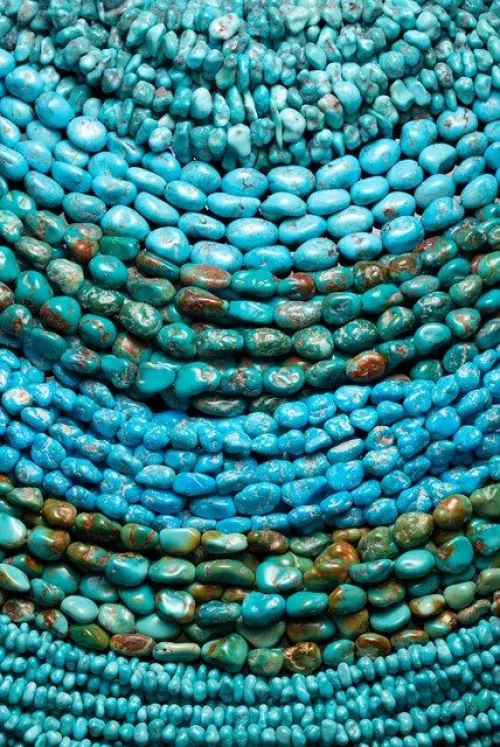
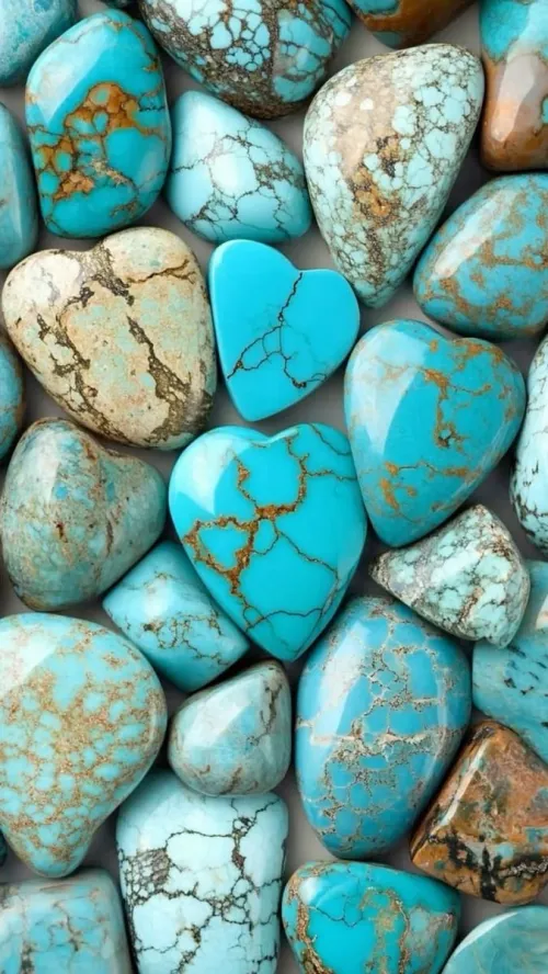
Material origins greatly impact hue authenticity. Natural turquoise mineral veins exhibit unique matric patterns affecting color depth—copper deposits naturally yield distinctive vibrancy unachievable in synthetics. Conversely, teal's origins relate to waterfowl feathers and doesn’t have organic matrices. Dye composition matters too: teal formulas incorporate more blue dye density (approximately 15% higher concentration for depth retention), while turquoise requires white bases to sustain brightness during production.
Surface texture reveals natural origins Examine materials under magnification. Turquoise stones typically show inorganic veining while solid teal dyes lack this complexity.
Dye specifications indicate artificial sources Check manufacturer pigment formulas to identify whether they use mineral-based versus synthetic pigments.
Many believe the names derive from related natural phenomena suggesting color identity—both linked to water or tropical imagery. This perception occurs when marketing descriptions vaguely reference "ocean blues" without distinguishing the historically distinct origins of the names.
Historical records prove distinct naming lineages. Teal originates specifically from the stripe around certain ducks' eyes observed in 1917. Turquoise directly stems from 16th-century French references to opaque mineral stones prized for their unique copper-created hues. This explains why teal rarely appears in vintage mineral collections but dominates contemporary design palettes.
Mastering these distinctions means training your eye for critical details. When uncertainty surfaces—whether you’re selecting paints, fabrics, or digital palette—use the BLU test. Check the Blue dominance with this rule: does the hue lean >60% towards blue saturation? That’s teal’s domain. Assess Luminance levels; authentic turquoise typically shines 20-30% brighter. Finally, consider the Use context: jewelry contexts lean toward turquoise minerals, while contemporary textiles typically reference teal formulas. Compare multiple light sources to avoid environment illusions. Next time someone claims they’re identical, you’ll recognize the nuanced differences at sunset or under gallery lighting.
Q: What are the specific hex codes for pure teal versus turquoise?
A: Teal typically exhibits HEX codes near #008080 (RGB 0,128,128) while turquoise aligns closer to #40E0D0 (RGB 64,224,208). Digital screens and print systems may render variations due to color space limitations affecting brightness balance.
Q: Why might teal appear greener in bright lighting conditions?
A: Under strong illumination, teal may shift toward more visible green undertones despite its blue dominance. This happens because intense light alters our perception of the green elements within its cyan composition—though blue saturation remains higher than turquoise.
Q: How do natural turquoise minerals differ from dyed fabrics?
A: Natural turquoise forms through geological copper-aluminum interactions creating distinctive veined matrices and subtle color variations. Artificial reproductions often lack depth retention and the characteristic mineral luminosity, fading unevenly under UV light exposure according to pigment quality.

$