Key takeaway: Turquoise coordinates harmoniously with colors like coral, navy blue, and neutral tones such as beige or gray. Warm complementary hues based on color theory and balanced saturation levels contribute to cohesive combinations. Environmental factors including lighting conditions and material textures may significantly influence coordination effectiveness.

Imagine searching for that perfect outfit accent pillow to pair with your turquoise statement piece, only to discover your careful selection appears mismatched under different lighting. This common frustration touches designers, stylists, and homeowners alike. Unlike predictable neutrals, turquoise occupies a spectral crossroads teetering between blue tranquility and green vitality. Its mercurial nature means a pairing that delights in boutique lighting may feel jarring at home. This article demystifies turquoise coordination by exploring how material texture, lighting shifts, and color undertones transform perception. Rather than universal rules, you'll discover adaptable principles that help navigate the complexities of this transformative hue across fashion and design contexts. We'll dismantle common myths—like turquoise being universally compatible—and explore situational nuances.
Why turquoise appears different in morning light versus artificial lighting
How fabric textures can change turquoise coordination dynamics
Why identical turquoise may need different pairings for fashion versus home décor
How seasonal lighting shifts might influence your choices
Why proportion often matters more than specific colors
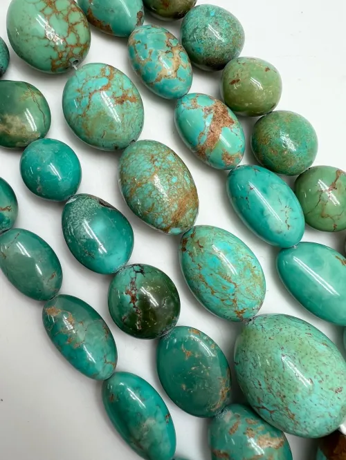
Many assume turquoise exists as a stable midpoint between blue and green – a predictable, universal pigment. This leads to disappointment when a turquoise pairing that worked online fails in person. The notion stems from simplified color wheels showing turquoise as a fixed position.
Reality reveals turquoise straddles a spectrum where blue or green dominance creates distinct personalities. Mineral sources show this variation clearly: Arizona turquoise leans blue-green while Persian varieties exhibit greener tints. These shifts influence pairing compatibility. For example, blue-dominant turquoise may harmonize with peach-tinted corals where greener versions favor softer neutrals. This natural variation explains why color matches often demand context-sensitive judgment rather than formulaic combinations.
Observe undertones under natural light against pure white paper. A green-biased turquoise often pairs elegantly with cool creams and beiges. Notice bluer versions? Earthy corals may create more satisfying contrasts.
People frequently rely on digital screens coordinating turquoise assuming consistent appearance across environments. This misconception leads to surprises like daylight revealing unseen green tones or artificial lighting flattening vibrant combinations.
Lighting environments manipulate perception significantly. Daylight’s full spectrum allows turquoise pigments to express their complete personality. Artificial lighting – especially warm-toned bulbs – may mute blues while enhancing greenish qualities. Picture a turquoise backsplash changing subtly through the day: morning light may heighten oceanic blues while dusk casts mossy shadows. Coordinated colors must therefore prove adaptable. Navy offers reliable stability but bold choices like coral can appear differently across environments.
Analyze potential pairs in three light conditions: direct sunlight, indirect daylight, and artificial lighting. Shifts become noticeable when a coordinating beige appears grayish indoors. Such variations signal complementary colors requiring broader compatibility ranges.
Most overlook texture's role in coordination assuming colors interact similarly across satin or coarse fabrics. This leads to puzzling inconsistencies when identical turquoise appears richer in velvet yet flatter in linen.
Reflective properties dramatically alter the experience. Lustrous silk creates shimmering depth around turquoise while matte cotton absorbs light creating grounded solidity. Consider jewelry combinations: smooth turquoise stones paired with delicate gold chain create sophisticated contrast. The identical stone beside rope-textured accessories may feel bohemian. Similarly, a high-gloss turquoise wall requires different complementary choices than matte-finish counterparts. This explains why material samples prove indispensable before committing to substantial pairings.
Compare identical turquoise hues on smooth metal and textured cloth under uniform lighting. Notice depth variations? Gloss surfaces often demand deeper complementary shades than matte counterparts for optical balance.
A persistent myth suggests universally effective coordination schemes. This manifests when homeowners apply fashion-inspired coral/turquoise combinations that overwhelm living spaces or fashion enthusiasts choosing overly subtle interior schemes.
Functional priorities differ dramatically across applications. Fashion statements often prioritize vibrancy through bold accents – think coral handbags against turquoise dresses. Interior spaces demand enduring harmony where intense contrasts might become visually exhausting. Decor palettes typically layer neutrals as foundations whereas runway coordination often emphasizes maximalist expression. The common solution? Scale matters. A navy sofa provides reliable foundation for turquoise decor but swap proportions and your room becomes submerged underwater. Proportion adjustments serve as crucial leverage points.
People overlook origin differences assuming all turquoise radiates similar character. Consequently, synthetic approximations get mismatched with mineral-inspired palettes.
Authentic mineral turquoise contains organic matrix patterns which create subtle shading impossible to replicate chemically. These natural imperfections become visual assets that interact gracefully with earth-toned companions. Synthetic equivalents achieve uniform saturation which risks appearing artificial beside complex textures. Understanding this spectrum helps you adapt pairings successfully. Mineral-adjacent palettes may incorporate browns and terracotta while high-saturation synthetics often need neutral mediation.
Conventional wisdom suggests striking contrasts guarantee coordination success. Unchecked, this approach risks visual chaos where competing elements overwhelm without balance through proportion and depth.
Contrast operates along a spectrum. Vibrant coral creates exciting tension against turquoise but requires careful proportioning to prevent overwhelm. Think statement jewelry versus dominant garments: accent scarves succeed where equal-area pairings often clash. Scale considerations extend beyond measurements to tonal weight and complexity. A complex pattern using turquoise as base may handle only minimal complementary accents whereas solid turquoise offers flexibility. Historical textile traditions validate this through rule systems where accents occupy no more than one-third presence.
Analyze the surface area distribution where turquoise dominates the design context. Notice how small coral details energize without disruption? Scale becomes crucial for maintaining harmony.
The foundation-first approach tends to yield reliable turquoise coordination: begin neutrals like beige or gray for anchoring then layer complementary hues in proportion-limited accents. Testing combinations under varied lighting conditions may help identify pairings that adapt gracefully throughout daily rhythms.
Consider keeping a physical sample journal to document surprising combinations that might be otherwise forgotten. Small fabric swatches paired with paint chips offer invaluable insight into turquoise’s contextual behavior.
What complementary colors work best with dark turquoise?
Deep turquoise harmonizes effectively with warm peachy oranges rather than bright corals. Consider grounding with deep charcoal neutrals then adding metallic accents for dimension control.
Why consider analogous colors like aqua when pairing with turquoise?
Aqua offers tonal expansion opportunities since sharing spectral properties. This creates cohesive palettes for layered designs while requiring less strict proportion limitations compared to high-contrast combinations.
How does lighting alter turquoise coordination choices?
Transition through daily light cycles reveals color shifts. Artificial lighting may require subtle adjustments for harmony while north-facing environments may demand brighter accents to balance cool natural lighting.
What value does coral add when coordinated with turquoise?
Coral introduces vibrant complementary contrast that accentuates turquoise's cool tones. However limiting its presence to roughly one-fourth the visual area helps prevent visual tension.

$