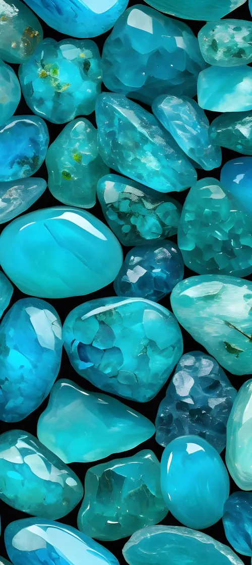
Turquoise blue is a medium blue-green color named after the turquoise gemstone that exhibits a balance between blue and green tones, typically described as cyan with reduced lightness and saturation. Its exact hue varies significantly based on mineral composition and processing—copper creates blues while iron impurities introduce green undertones. Industry standards like Pantone 15-5519 define it as more cyan (HEX #45B8AC), though geological samples naturally range from green-dominant to blue-dominant spectrums.
You've likely used "turquoise blue" to describe everything from Caribbean waters to vintage jewelry, assuming it's a fixed shade. Yet under changing light or with varied origins, your summer necklace might appear oceanic blue indoors but unexpectedly greenish at sunset. This article unpins that color ambiguity through mineral science and cultural history. We’ll challenge five common color assumptions, reveal why lighting transforms perception, and show how ancient Persian artisans prized different blues than Indigenous Americans. Instead of arbitrary definitions, you’ll learn to decode turquoise through physical cues – a skill transforming how you view art, gems, and even interior design.
How does chemistry shift turquoise from blue to green?
Why do Pantone standards and mineral samples disagree?
Can indoor lighting distort the color you see?
Did historical cultures value the same blue?
Do enhancements alter natural coloring?
Many assume turquoise derives its blue solely from copper concentrations. This seems logical—copper minerals like azurite show vivid blues, and turquoise’s chemical formula (CuAl₆(PO₄)₄(OH)₈·4H₂O) highlights copper as essential. People naturally correlate higher copper with purer blues.
Ironically, impurities create the most valued colors. When iron ions replace aluminum in the molecular structure, green undertones emerge—explaining why top-grade "robin’s egg" blue requires trace zinc to suppress greenness. Similarly, turquoise from Nevada’s mines often looks celery-toned due to iron-rich geology. This elemental ballet means copper determines intensity while contaminants dictate hue variance.
Matrix veining: Under 10x magnification, brown-black web patterns confirm natural formation. Dense veining contrasts against the base color, altering perceived saturation.
Moisture absorption Drop water on the surface—untreated stone absorbs it rapidly due to natural porosity, whereas polymer-stabilized pieces repel moisture.
The belief that turquoise occupies a fixed spot on the color wheel persists in design industries. Digital interfaces especially propagate this myth—you might’ve used #40E0D0 as “standard turquoise” expecting consistency across devices.
Reality fractures this illusion. Pantone's 15-5519 TPX leans cyan at 190° on the CIE chromaticity diagram, while pre-Columbian artifacts favor 170° green-dominant shades. Geological samples further stretch this range: Persian specimens hit 205° (azure-like), whereas Arizona’s Bisbee mine yields 178° teal derivatives. Synthetic turquoise replicates Pantone precision but lacks subsurface color-play from natural impurities.
Brighter saturation typically signals higher copper content, yet diminishes subtlety collectors adore in iron-zinc matrix blends. Greener hues compensate with structural stability—their iron matrices resist chipping.
Ever notice your turquoise ring changing hue indoors? Many assume its color stays constant, leading to mismatched jewelry repairs or paint choices. Stores exacerbate this with uniform LED lighting that masks natural behavior.
Sunlight’s full spectrum emphasizes blue wavelengths in turquoise, making Nevadan stones appear paradoxically azure at noon. Warm indoor lights meanwhile boost green/red reflectance—your Persian gem suddenly looks mossy. Spectral reflectance peaks at 490nm explain this: photons activate trace minerals differently per light source. Photography compounds errors; smartphones omit UV/IR influences visible to spectrophotometers.
The white balance test: Photograph stones beside a neutral gray card under mixed lighting. Cameras often distort green/blue ratios without this reference.
North daylight verification: Evaluate samples near windows facing true north—or under 5500K bulbs simulating indirect sunlight—to minimize spectral distortion.
Modern branding frames turquoise as universally sky-inspired, yet civilizations disagreed fundamentally. You’ve probably seen "Southwest turquoise" jewelry assuming it matches Old World standards—an understandable error fueled by generalized marketing.
Persian artisans selectively mined Nishapur stones for pure sky-blue (205°), rejecting greenish pieces as “imperfect.” Contrast this with Aztec "chalchihuitl"—a distinct green-dominant mineral (avg 173°) used in sacrificial knives. These preferences weren’t aesthetic whims but resource-driven; Mesoamerican deposits leaned iron-heavy while Iranian veins had zinc purity. Colonial trade later blurred these boundaries, merging palettes into today’s broad “turquoise” umbrella.
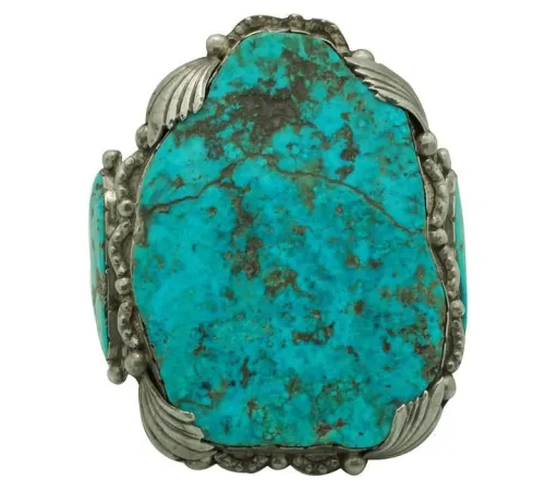
When appraising antiquities, expect uneven zoning; large stones show deeper blues centrally with paler edges due to crystallization patterns. Pre-1800 artifacts may also display dehydration shifts—their blues greening over centuries as humidity drops.
Seeing ultra-vivid turquoise, most assume it’s naturally saturated. Retailers encourage this, obscuring treatments that turn desert-matte stones into glossy jewels. After all, enhanced pieces dominate affordable markets.
Raw turquoise absorbs human skin oils and discolors over time—leading to stabilization practices. Epoxy resin infusions not only prevent this but amplify color 20-40% beyond nature's limits. The process seals microscopic pores responsible for whitening under sunlight and dehydration. However, the same treatment eliminates telltale flaws like organic veining or subtle chalkiness—dead giveaways of authenticity some experts prefer.
Surface reflectance test: Tilt stones under direct light. Waxy luster indicates natural surfaces, while glass-like shine suggests polymer coatings.
UV fluorescence: Shine long-wave ultraviolet light in darkness—blue-green glows signal manufactured composites. Natural pieces rarely fluoresce.
Thermal response: Touch to your lip. Genuine minerals feel noticeably cooler than resin-treated substitutes or fakes within seconds.
Consider every turquoise encounter an invitation to slow down and see deeper. When you admire a gallery piece or select jewelry, ask about its origin humidity—porous stones reveal their true character in moist environments. Carry a small gray card; comparing gems to this neutral ground cancels deceptive lighting. Value subtle imperfections; iron's green whispers and spiderweb veins chronicle each stone's formation struggle. This mindset transforms shopping from passive selection to active mineral discovery.
Q: Why does some turquoise appear more green than blue?
A: Iron impurities typically cause green dominance. Concentrations vary by deposit, causing Arizona stones to appear more forest-toned than Iranian ones.
Q: How does turquoise blue differ from teal?
A: Teal combines deeper blues and greens at CIE 179-195° with lower lightness – essentially, turquoise is teal’s brighter, slightly bluer cousin.
Q: Why is Persian turquoise the chromatic benchmark?
A: Nishapur mines yielded rare zinc-dominant stones achieving "robins-egg" blue. Their chemical stability and historical provenance established the standard.
Q: What magnification reveals true turquoise composition?
A: 10x lens magnification exposes natural matrix veining. Higher resolutions (40x+) show crystal patterns synthetic materials can’t replicate.
Q: Do ultraviolet rays damage turquoise?
A: Prolonged direct UV exposure may dehydrate untreated pieces, shifting color toward green.

$