Turquoise and teal are distinct colors often confused due to their blue-green spectrum overlap. Turquoise leans brighter with blue dominance (hex #40E0D0), while teal appears deeper with green bias (hex #008080). Accurate distinction requires examining standardized definitions and contextual factors like lighting or material origin.
Ever found yourself debating whether your new throw pillow was turquoise or teal? Or struggled to describe that perfect ocean hue you saw on vacation? That subtle blue-green spectrum triggers widespread uncertainty - even designers occasionally mix them up. This guide walks through five core aspects where assumptions about these colors diverge from measurable reality. We'll start with their origins and evolution, examine how lighting transforms appearances, explore cultural applications, and finally share hands-on methods to confidently differentiate them. Consider this your reference toolkit for navigating one of design's most delightful dilemmas.
Common Myths vs. Color Science: Why names don’t mean the same thing
Lighting’s Color Magic: How environment changes what you see
Material Truths: Where each color historically appears
Blue-Green Spectrum: Understanding their fluid relationship
Real-World Testing Methods: Simple ways to confirm identities
Many assume "turquoise" and "teal" are aesthetic synonyms describing identical blue-green shades. This instinct makes sense when browsing paint swatches or digital palettes where boundaries appear fluid. Casual conversations reinforce this notion as people use both terms loosely for aquatic-inspired colors without strict differentiation.
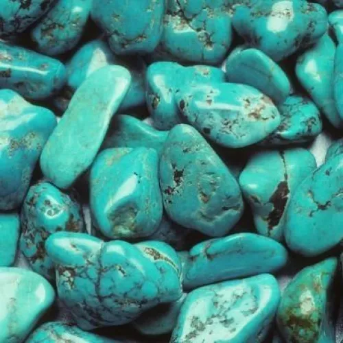
Reality anchors in tangible origins: Turquoise derives from gemstones streaked with copper matrix (named after French "pierre turquoise"), consistently skewing blue like Mediterranean shallows. Contrastingly, teal honors the common teal duck, whose neck feathers exhibit rich green-blue tones. Even dictionaries reflect this divide - turquoise centers on minerals, while teal references avian plumage. This separation manifests in standardized coding, where turquoise maintains cyan-leaning hex #40E0D0 versus teal's balanced #008080.
A prevalent assumption claims both colors share identical hue coordinates on visual spectrums. Human eyes perceive closely positioned shades similarly, leading to the "same slot" misconception especially with brief exposures. Design software dropdowns listing both options without clear demarcation further blur perceptual boundaries.
Digital and industrial standards reveal measurable differences: Pantone classifies turquoise equivalents like PMS 326 as brighter cyan-blues, while PMS 321 teal shades show deeper green dominance. Technical analysis proves turquoise occupies higher luminance (visual brightness) around 88% versus teal's comparatively muted 50%. The disparity becomes clear when comparing dye formulations - achieving true turquoise requires more blue pigment saturation, whereas teal demands precise green-blue balancing.
Casual observers often expect consistent color presentation across environments, imagining turquoise/teal look identical under sunshine, fluorescent lighting, or evening lamps. This belief stems from everyday objects like clothing appearing "unchanged" in different rooms - though subtle shifts actually occur.
Both hues transform dramatically under varying lights. Turquoise intensifies in direct sunlight, emitting radiant cyan-like qualities that mimic tropical waters. Teal conversely gains richness in shaded or indoor conditions, revealing emerald undertowns obscured under harsher illumination. Material properties enhance these differences: while a teal-painted wall develops moodier depths at twilight, turquoise gemstones maintain higher reflectivity. When adjacent to warm colors like yellow, strong contrast signals turquoise's blue lean, whereas teal blends more naturally with greens.

A functional equivalence myth suggests both colors serve interchangeably across industries. When artists describe sea landscapes or designers specify brand palettes, "teal" and "turquoise" are sometimes used variably without technical rigor, implying identical usage potential.
Actual applications reveal specialized domains: Turquoise dominates jewelry and craft spheres, tracing back to Ancient Egyptian symbolic stones prized for spiritual connotations. Teal thrives in digital interfaces (website buttons, UI elements) where its balanced neutrality aids readability, especially popular during 2000s web design. Cultural preferences further influence terminology - Mediterranean cultures reference turquoise more frequently for ceramics, while South Asian textile traditions favor teal silk dyes. Even manufacturing techniques differ: authentic turquoise gemstones display unique matrix veins, whereas teal fabrics under UV testing show complex green dye layering.
People often seek rigid definitions - "Turquoise is precisely X, teal is exactly Y". This craving for clear separation overlooks how pigments blend across nature and design. Rigid mental categories form when viewing isolated swatches rather than continuous spectra.
Turquoise and teal exist on a fluid chromatic continuum: Some turquoises exhibit green tints depending on mineral impurities, while deep teals merge with naval blues. When light temperatures shift, distinctions become more nuanced - warm incandescent bulbs pull turquoise toward green, while cool LEDs make teal appear bluer. Physical form also matters: synthetic teal pigments offer uniformity, yet natural turquoise stones display mesmerizing imperfections. Across cultures, naming customs further blur lines; certain languages use unified terms regardless of hue position.
Concrete testing methods clarify ambiguities where human eyes struggle to distinguish these chromatic cousins.
Use color picker tools on suspicious swatches - hex #40E0D0 confirms turquoise while #008080 indicates true teal. RGB comparisons reveal turquoise typically measures higher blue values
Examine materials in sunshine at midday - bright cyan dominance suggests turquoise, whereas persistent green undertones indicate teal despite brightness variations
Note how shades behave indoors: turquoise maintains sparkle under lower light, while teal exhibits chameleon-like depth. Also inspect surfaces at 45-degree angles; turquoise gemstones reveal signature matrix patterns under magnification, unlike teal's uniform finishes.
Next time you encounter blue-green ambiguity, remember these takeaways: Turquoise glows like Caribbean waters; teal whispers like forest ponds. Where quick judgments fail, science offers clarity - grab your phone's color picker to decode hex mysteries without guessing or place fabrics against yellow to test green bias. For a hands-on challenge, find two paint swatches and place them under different lamps - notice how your perception shifts? Mastering color distinctions takes practice. Celebrate that moment when you confidently identify that elusive blue-green shade at first glance.
Q: What scientific variables best distinguish them?
A: Compare saturation levels as turquoise shows brighter blues, and observe hue angles - teal has demonstrably lower luminance and green-bias when measured objectively.
Q: How do geological origins differ?
A: Turquoise forms through copper deposits in rock cavities, resulting in unique matrix patterns, whereas teal’s nomenclature traces to organic sources like bird feathers without mineral definitions.
Q: Why value natural turquoise higher?
A: Authentic turquoise involves complex geological formation processes, unlike consistently reproducible teal pigments, making genuine minerals costlier and visually distinctive.
Q: What pronunciations clarify meaning?
A: Turquoise (/ˈtɜːrˌkwɔɪz/) maintains clear gemstone associations, while teal's single-syllable (/tiːl/) often signals manufactured dye contexts.

$