Turquoise pairs most effectively with warm neutrals like beige, brown, and creamy whites that complement its earthy undertones. Precious metals including silver, gold, and rose gold enhance its natural hues, while coral accents create vibrant Southwestern combinations. High-contrast pairings with deep reds require careful saturation consideration for visual harmony.
Ever stood before your closet holding that stunning turquoise necklace, wondering why some outfits make it sing while others make it disappear? You're not alone. Many assume turquoise just pairs with other blues, but as you'll discover, this complex gem reveals hidden dimensions under different lights and settings. This guide walks through nuanced color harmonies - how that Southwest turquoise rug transforms with leather versus silk, why gold settings deepen earthy veins in your ring's stone, and when saturated reds actually work. We'll unpack five key misconceptions and practical solutions for real-life styling.
→ Why do metals affect turquoise's appearance differently?
→ Can patterned fabrics highlight rather than distract?
→ How lighting transforms blue-green balance
→ What makes darker turquoise unexpectedly valuable?
→ Avoiding "why did this turn green?" disasters
Many believe turquoise only matches its blue-green siblings, but that view misses its earthy soul. This assumption often comes from seeing turquoise displayed against cool-color backgrounds in stores. Here's the reality: When placed beside warm neutrals like terra cotta clay or walnut leather, turquoise reveals hidden harmonies. The same stone can pull bluer against beige but reveal olive undertones near chocolate browns. Historical Southwestern designs demonstrate this instinctively - Navajo artists would set turquoise nuggets alongside coral that draws out its warm dimension while grounding it with desert-toned leather.
People often think all metals act neutrally with turquoise. While silver feels like the customary choice, observe how different metals transform the stone's personality. Silver amplifies aquatic blue notes beautifully with Persian robin's-egg variants. Meanwhile, gold settings have an optical effect - they highlight the yellow-green veins in American turquoise specimens. Picture your favorite turquoise ring in morning light: rose gold settings can soften warm-cold tensions with its blended metallic tone. The key consideration? Match metal to the stone's character rather than defaulting to tradition.
Assess the stone's undertone: Blue-dominant turquoise shines in silver, while green-veined varieties gain richness from gold.
Consider context: Earth-toned outfits harmonize best with yellow gold settings.
Practical testing tip: Lay jewelry pieces on white paper under daylight to see true color interactions.
Patterned fabrics get avoided with turquoise accessories from fear of visual chaos. Yet traditional Zapotec weavings show how geometries with natural anchors work beautifully. The secret lies in pattern selection: Tribal designs featuring intersecting brown and coral lines form visual pathways connecting turquoise jewelry to your outfit. Imagine geometric pillow textiles with terra cotta diamonds - they create compositional balance that frames rather than competes with your pendant. Conversely, avoid competing with small-patterned florals which may clash unless sharing the same earth-toned base colors.
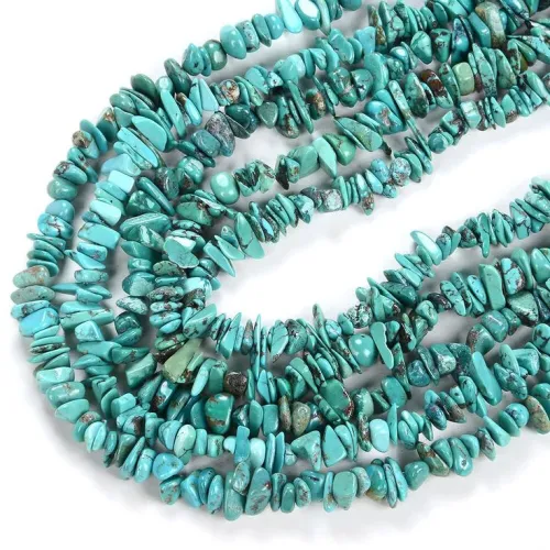
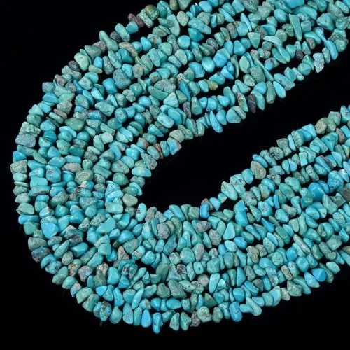
Brightness feels like the obvious value marker, but collector preferences defy that assumption. While Persian specimens gain value through iconic robin's egg uniformity, American collectors often prize what others dismiss as "imperfections". Complex matrix patterns resemble organic desert landscapes in miniature - webbing patterns caused by decomposed host rock can triple a stone's uniqueness. That deeply saturated Sleeping Beauty turquoise? Its color intensity often correlates with porosity requiring stabilization treatments. Understanding these nuances helps assess real long-term worth over mere visual impact.
Matrix examination: Check for irregular webs under magnification indicating natural origin.
Absorption test: Place water droplets on inconspicuous spots - rapid absorption suggests untreated material.
Luster differences: Natural turquoise shows waxy reflections versus synthetics' unnatural shine.
Assuming turquoise remains static under different lights is a common pitfall. Physics explains this transformable quality - its 490-520nm wavelength position makes it sensitive to lighting color temperatures. Notice how incandescent bulbs bring out hidden green notes through their warm yellow bias, while gallery-like cool lighting gives blue dominance. This explains why your favorite bracelet never quite matches across different rooms! Copper content generates blue tones while iron creates greens, and skin chemistry over years may gradually warm the stone. Protecting turquoise from cosmetics and acids prevents undesirable color shifts.
Let's put theory to practice with actionable strategies: For belt buckles or bolos, embrace brown leather companions that spotlight turquoise's rustic elegance. When building Southwest-inspired tablescapes, add terracotta pottery and coral accents to bridge turquoise textiles with warm terracotta walls. Silver settings keep Persian blue turquoise looking fresh and aquatic during summer months. Remember this simple rule of thumb: Light-toned beads achieve maximum visibility against dark fabrics while controlling saturation prevents gem-drowning in competing colors. Finally, store pieces in anti-tarnish bags away from diamonds to prevent scratches - turquoise's 5-6 Mohs hardness needs protection.
Start your turquoise journey by observing one thing: How its personality shifts at different times of day. Which unexpected combination surprised you today?
Q: Why does turquoise discolor around chemicals?
Copper content reacts with acids and cosmetics causing greenish shifts - isolate from lotions/cleaners.
Q: Do treated stones maintain value?
Resin stabilization is standard practice - still considered "authentic" as untreated gems are rare outside museums.
Q: What stones resemble green-dominated turquoise?
Variscite offers similar mossy greens; amazonite provides greener blues at gentler price points.
Q: Can heat damage jewelry?
Stabilized pieces tolerate normal wear but avoid saunas/high-heat surfaces over 150°F to protect resins.

$